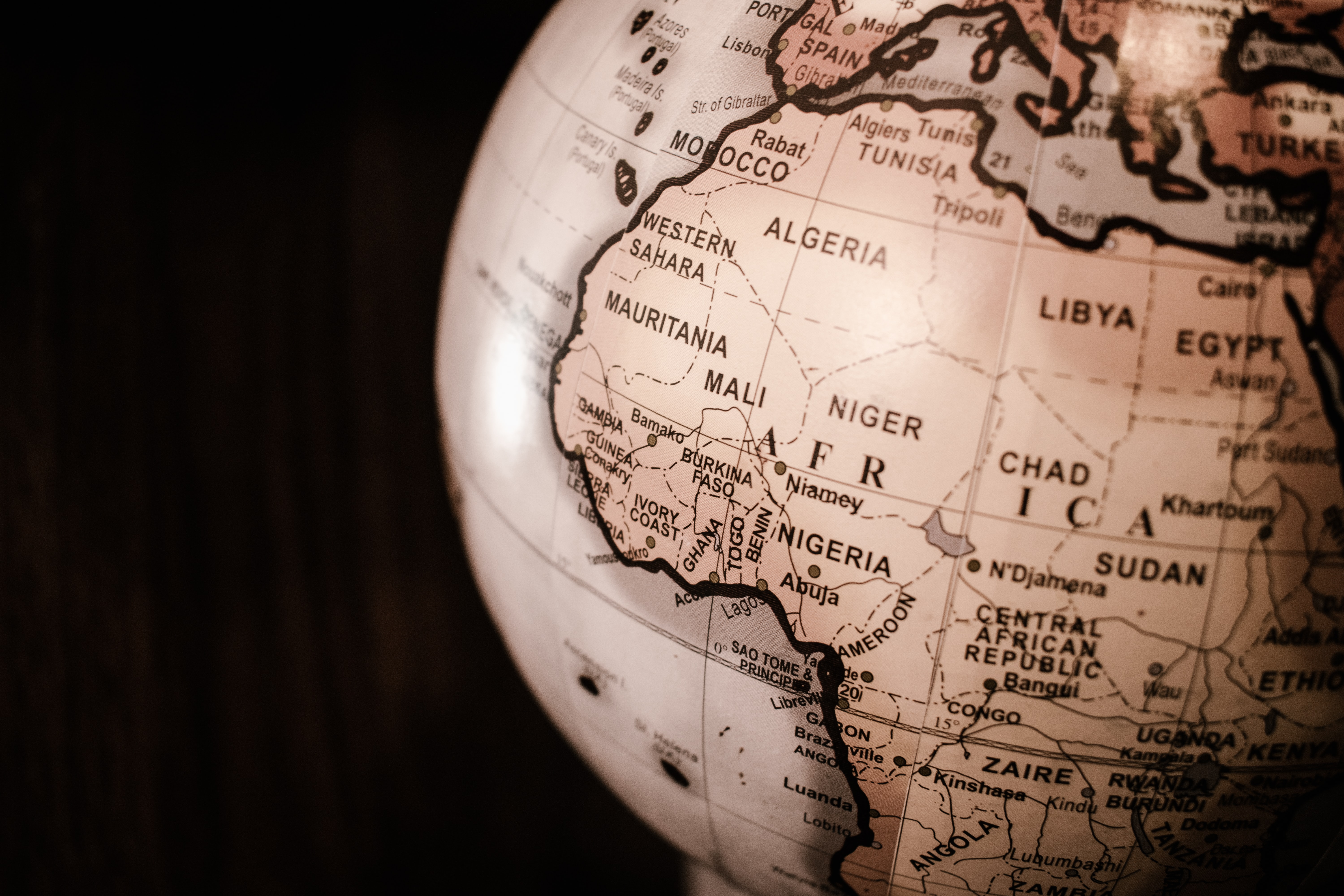
The Mercator Projection Map has been around for centuries. Created by Gerardus Mercator in 1559, it was initially designed to help sailors navigate waters and was unique in its representation of "north as up and south as down." But while the general shapes and locations of the land masses remained intact, its cylindrical projection also meant that the sizes of countries were grossly misrepresented. For instance, Africa is roughly 14 times larger than Greenland, but according to this map, they are the same size.
Why?
Does it come down to the creator of the map? Gerardus Mercator was a white man living in a time when slavery was common practice and Europe was "king." Is it really surprising that he made his continent the center of the universe? "The biggest economic powers were given the space on paper to flex their border biceps." On the other hand, one could argue it's simply the result of an imperfect design that doesn't necessarily target Africa. (Canada looks rather large when in reality, it's not much bigger than Australia.)
Fast-forward a few hundred years later, and the AuthaGraph Map is born. Invented by Japanese architect Hajime Narukawa in 1999, he represents the world on a 2D rectangle. It's an improvement as it doesn't have "some of the major distortions" of its predecessor and even won the 2016 Good Design Grand Award from the Japan Institute of Design Promotion.
Yet, despite the achievement of the AuthaGraph map -- and its more accurate representation of the world as a whole -- the Mercator map and all its inaccuracies is still the one commonly used to teach and represent the world's geography today.
Again, why? |